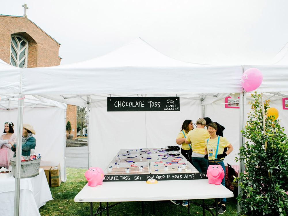
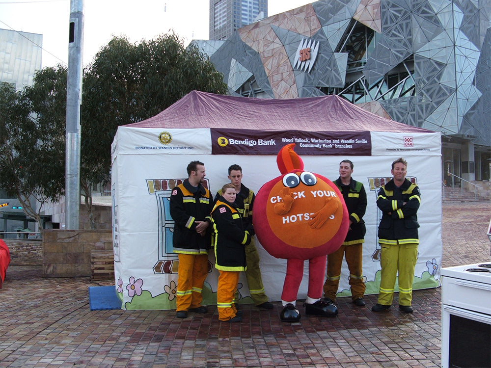
A pop-up marquee isn’t just about shade. It’s also a highly visible branding tool. Whether you’re a school at an interschool carnival, a sports club at a weekend competition, or a council or corporate team running a community event, your marquee can speak volumes before you say a word. But not all branded marquees hit the mark. Sometimes, despite good intentions, the final result doesn’t work as well as it should—and the opportunity for impact is lost. Over the years, we’ve seen what works and what doesn’t when it comes to marquee branding. So here are five of the most common mistakes we see, and more importantly, how to avoid them.
1. Trying to Fit Too Much Into the Design
This is by far the most common mistake: overloading the marquee with logos, text, colours, photos, or QR codes. The temptation is understandable—people want to make the most of the space and show everything at once. But less really is more. A cluttered design is hard to read from a distance and leaves no strong impression. Instead of drawing attention, it can actually confuse or overwhelm the viewer.
How to avoid it:
Focus on one or two key elements—typically your logo and a tagline, name, or slogan. Make sure there’s plenty of clear space around the text and images so they can be seen easily from afar. Think of your marquee as a billboard, not a brochure. If people want more information, they can come and talk to you.
2. Using Low-Quality or Unscalable Artwork
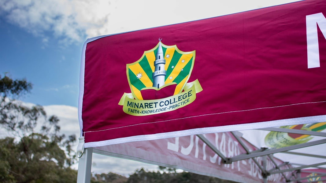
A marquee print is large—really large. That means images pulled from websites or social media, or low-resolution logos, will often print blurry or pixelated when scaled up. Even worse, incorrect file formats can lead to distorted shapes, incorrect colours, or missing design elements. It’s not just about how it looks either. Poor quality artwork can cause delays in the printing process if your designer or supplier has to chase replacements or redraw assets.
How to avoid it:
Use high-resolution vector files for all logos and graphics, such as EPS, AI, or PDF formats. If you don’t have access to these, speak to your branding provider early so they can help you prepare your artwork correctly. At Instant Shade, our in-house design team works directly with you to make sure your artwork is print-ready before it goes to production.
3. Not Thinking About Visibility at Eye Level
Most people think only about the roof when designing their marquee. But during events, much of the visual engagement happens at eye level. If you're using walls or half-walls, they offer great opportunities for messaging and branding—but too many groups leave them blank or underutilised. Even worse, some designs place important messages too high on the canopy peak, where they’re harder to read unless someone is far away.
How to avoid it:
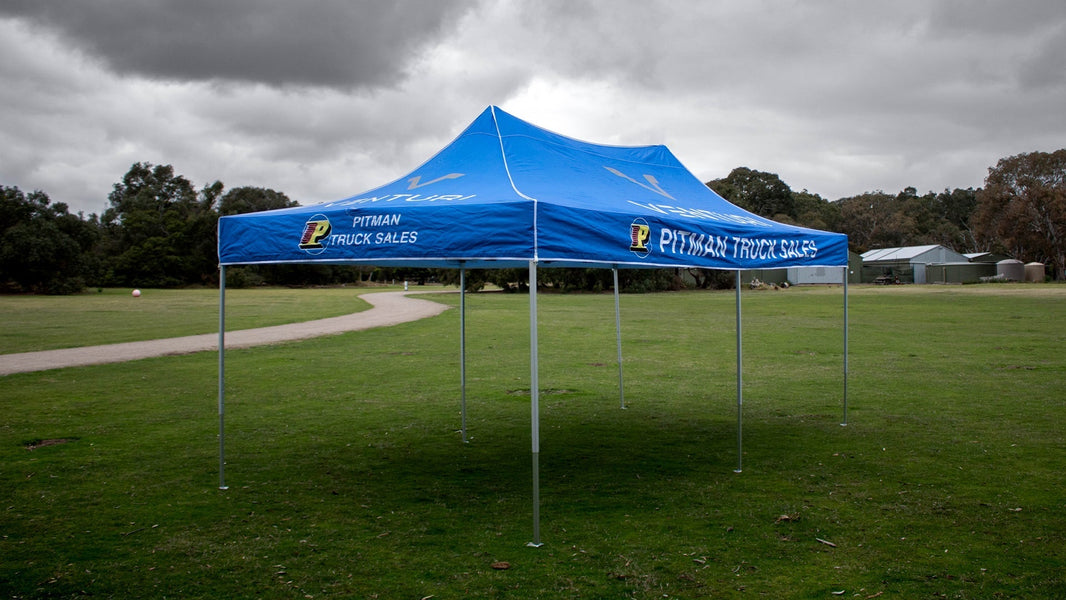
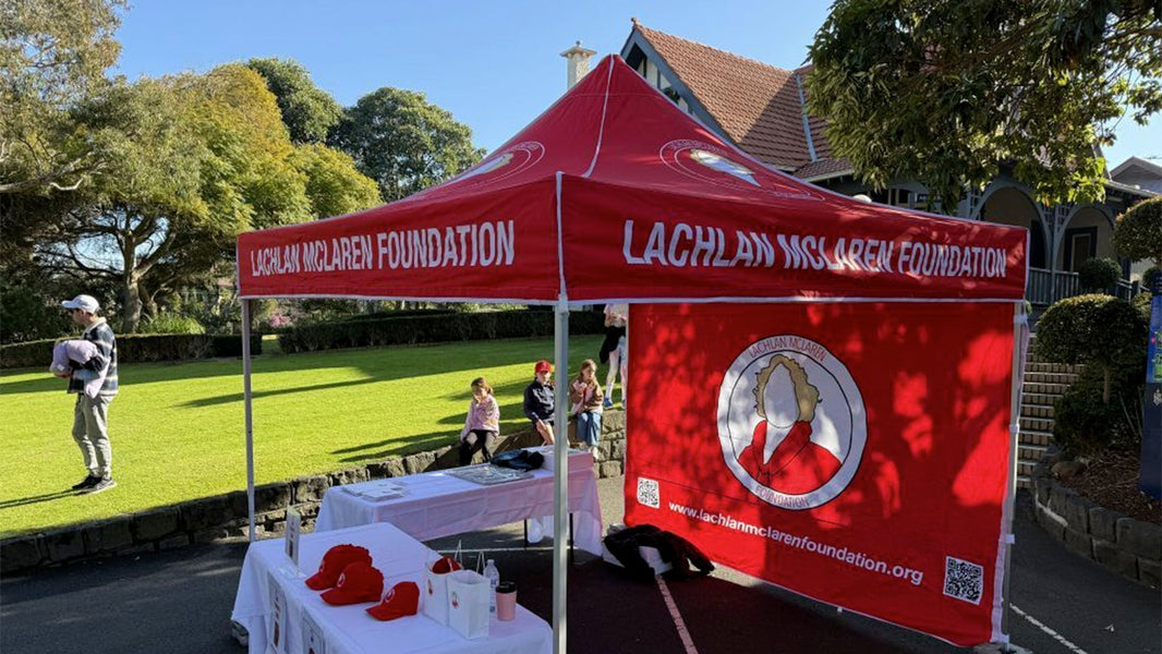
Plan your branding across the full 360 degrees of your marquee. Use the valance (the flat edge around the roof) for your main message or logo—it’s the most visible space up close. If you’re adding walls, make sure they’re printed and aligned with the overall design. For events like trade expos or community days, branded side walls are often where people notice you first.
4. Choosing Colours Without Considering the Environment
It’s important to think about where your marquee will be used. A colour that looks great on screen may fade into the background in real-world settings. Light colours can also show marks more easily, while dark colours may trap heat. Some groups also select colour schemes that don’t match their existing branding, creating confusion or a lack of cohesion across uniforms, signage, and digital channels.
How to avoid it:
Stick to your brand colours where possible, but think practically as well. Use contrasting colours for logos and text to ensure readability. If you need a specific colour match, Instant Shade can print the exact tone across your marquee fabric. And if you’re unsure, our design team can provide mockups and samples to help you decide.
5. Treating the Marquee as a One-Off
Marquees are long-term investments. A good one can last years. But sometimes, branding is rushed for a single event without thinking ahead. That can lead to messaging that quickly becomes outdated, irrelevant sponsor logos, or a mismatch with future uniforms and colours.
How to avoid it:
Think strategically about your marquee’s role in your organisation. Avoid date-specific slogans or overly event-specific designs. If you need temporary messaging, consider adding changeable banner sleeves or printed flags that complement the marquee without locking you into one message. At Instant Shade, we help groups create timeless designs that still feel fresh and flexible for multiple uses.
Bonus Tip: Don’t Skimp on the Frame
This one’s not about the artwork—but it still affects how your branding is seen. A wobbly, cheap marquee won’t do your design any favours. Sagging fabric or unstable frames can make even the best branding look second-rate.
How to avoid it:
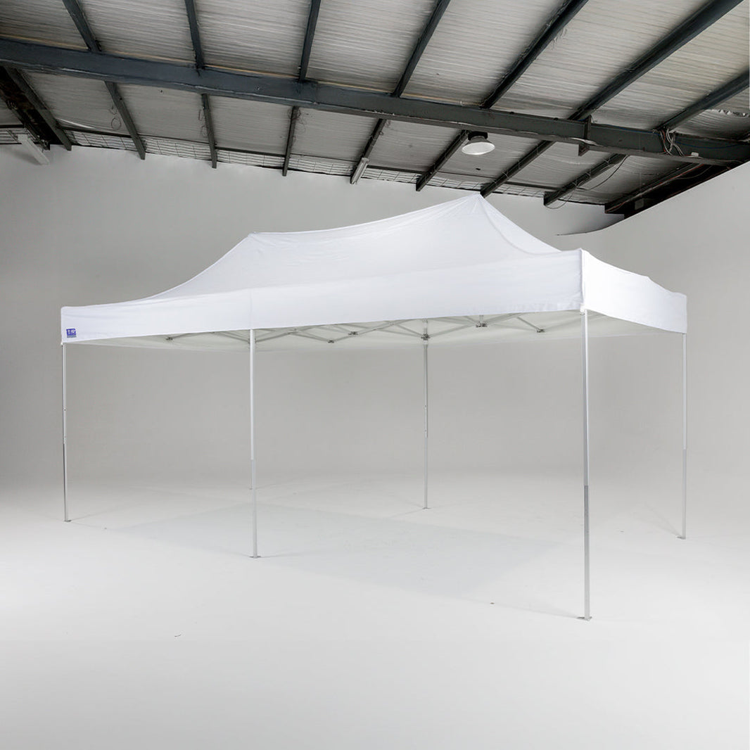
Invest in a quality frame that complements your design with strength and structure. Our NeoShade range offers both Deluxe and Heavy Duty options, with reinforced crossbars, anodised aluminium frames, and professional finishes that hold your branding flat and tight. Your marquee is a reflection of your organisation. Make sure it stands tall.
Why It Matters
Branding is more than just looking good—it’s about being recognised, remembered, and respected. At events where dozens of other groups are also trying to be seen, a well-branded marquee gives you a clear, professional edge. It tells people who you are and what you stand for. It can help bring in sponsors. It makes it easier for parents to spot their school tent or for a club to build its presence in a community. And when done well, it can elevate your image for years to come.
Work With a Team That Understands Branding
At Instant Shade, we’ve been helping schools, clubs, councils, and event organisers create standout marquees for nearly 30 years. We don’t just print logos—we work with you to design something that reflects your values, lasts the distance, and makes you proud to set up at any event. From choosing the right size and frame strength to guiding your artwork and colour choices, our team is here to help.


